Comparison of Scandinavian Countries based on Data until 30.04.2020
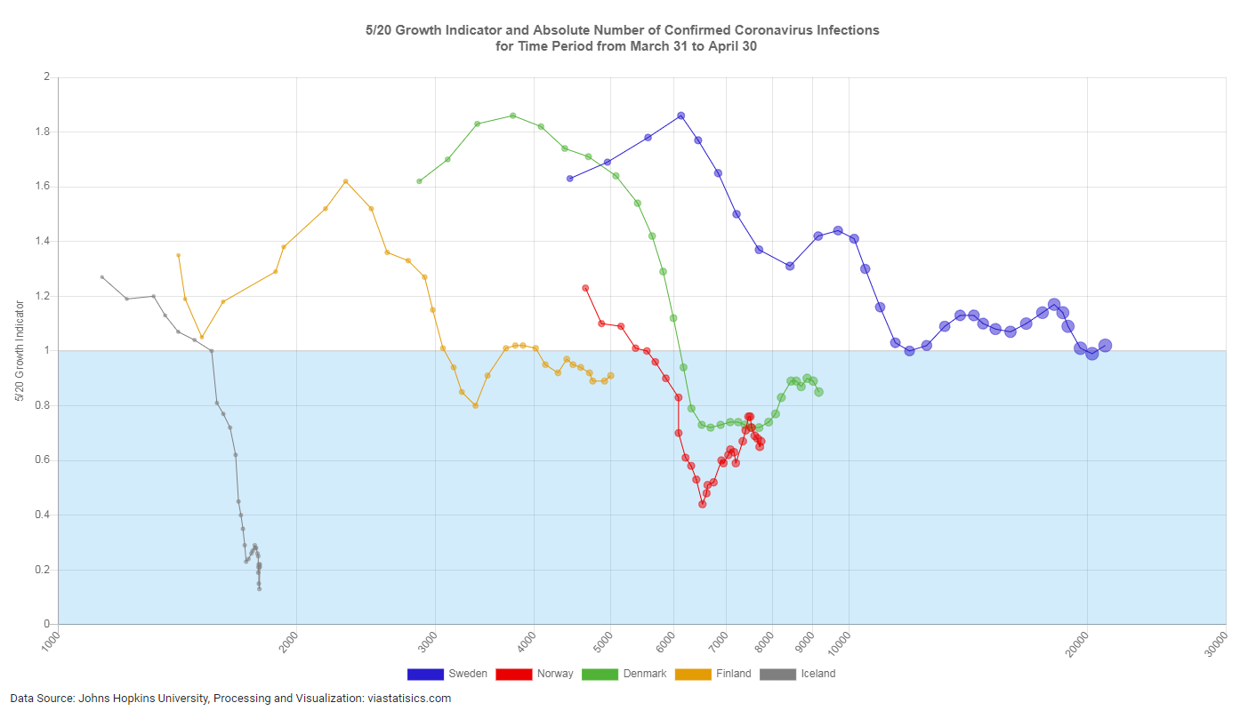
Explanation: On the x-axis of this diagram the number of confirmed Covid-19 infections is plotted with a logarithmic scale, on the y-axis the key figure „5/20 Growth Indicator“ is shown. For the scandinavian countries confirmed cases a circle (“bubble”) is shown for each of the 31 days from 31.03.2020 to 30.04.2020, where the area of the circle (at least for the larger circles) is approximately proportional to the number of confirmed Covid-19 infections.
So, the diagram shows the growth of the absolute number of cases for the last 31 days and the development of the key figure „5/20 Growth Indicator“ at the same time. See also here for an explanation on how to read this diagram and see the article Which Key Figure for Which Purpose? for an explanation of the 5/20 Growth Indicator.