Comparison of Key Figures of Brazil and Turkey
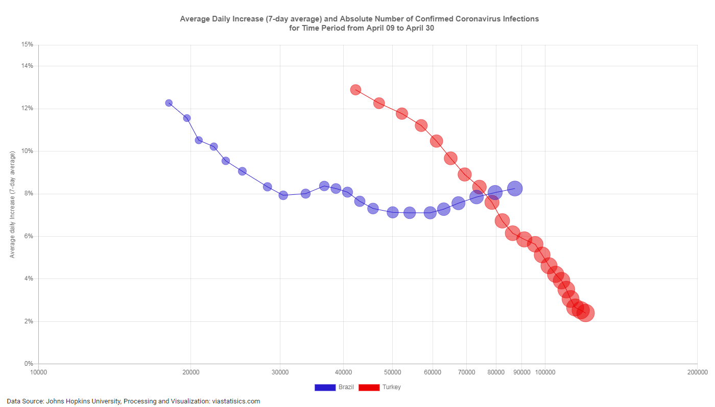
Explanation: On the x-axis of this diagram the number of confirmed Covid-19 infections is plotted with a logarithmic scale, on the y-axis the average daily increase of confirmed infections in percent (7-day average) is shown. For two selected countries – Brazil and Turkey – a circle (“bubble”) is shown for each of the 22 days from 09.04.2020 to 30.04.2020, where the area of the circle (at least for the larger circles) is approximately proportional to the number of confirmed Covid-19 infections.
So, the diagram shows the growth of the absolute number of cases for the last 7 days and the development of the key figure “average daily increase of confirmed cases in percent” at the same time. See also here for an explanation on how to read this diagram.
The reason for comparing Brazil and Turkey is that this comparison might show how different the consequences of the measures taken or not taken in Brazil on the one hand and in Turkey on the other hand are. If the current trend in Brazil will not change significantly within the next two weeks, it can be assumed that the absolute number of Coronavirus infections in Brazil will be higher than 180.000 by middle of May 2020.